THE MOKA SPOT- A Speciality Coffee Shop

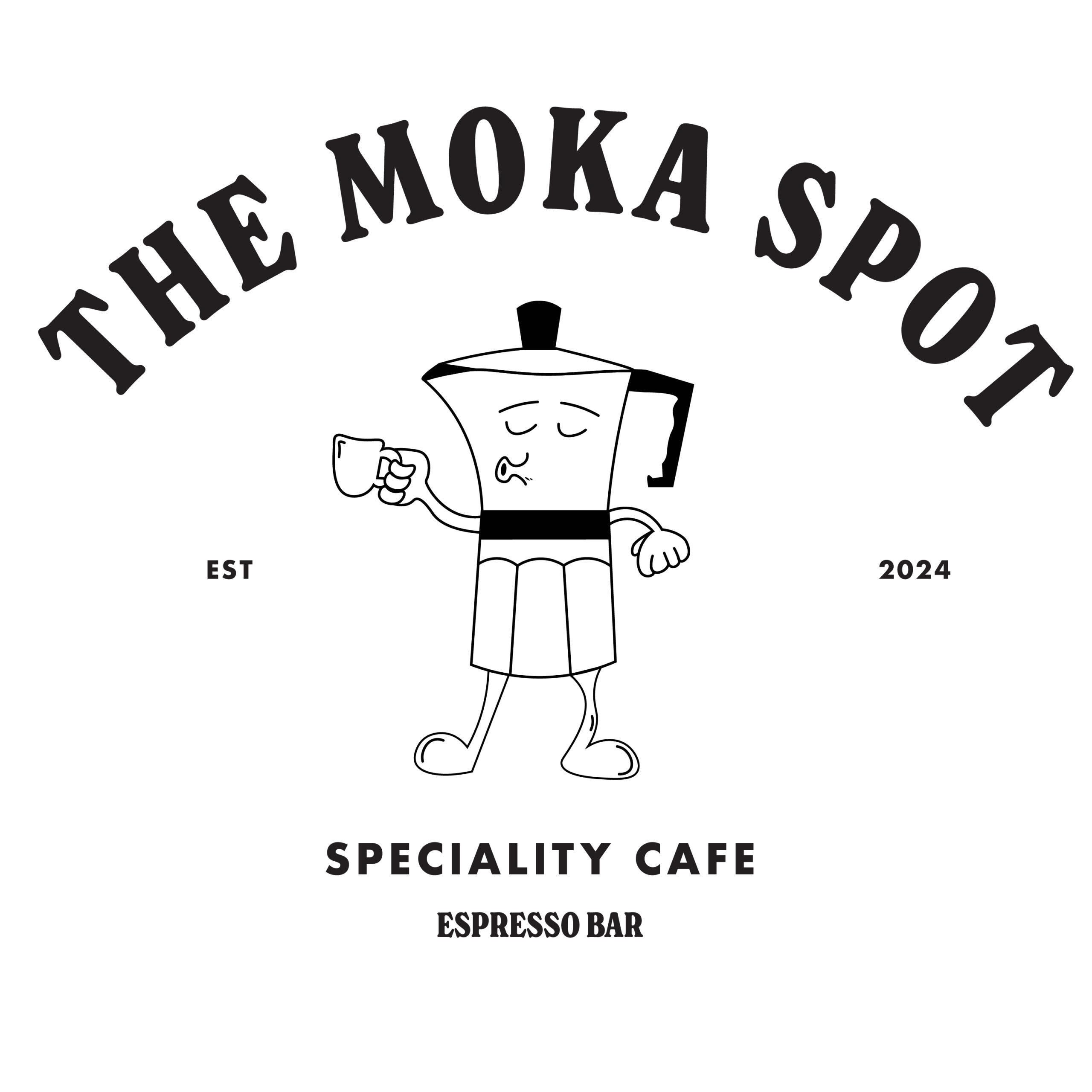
Logo
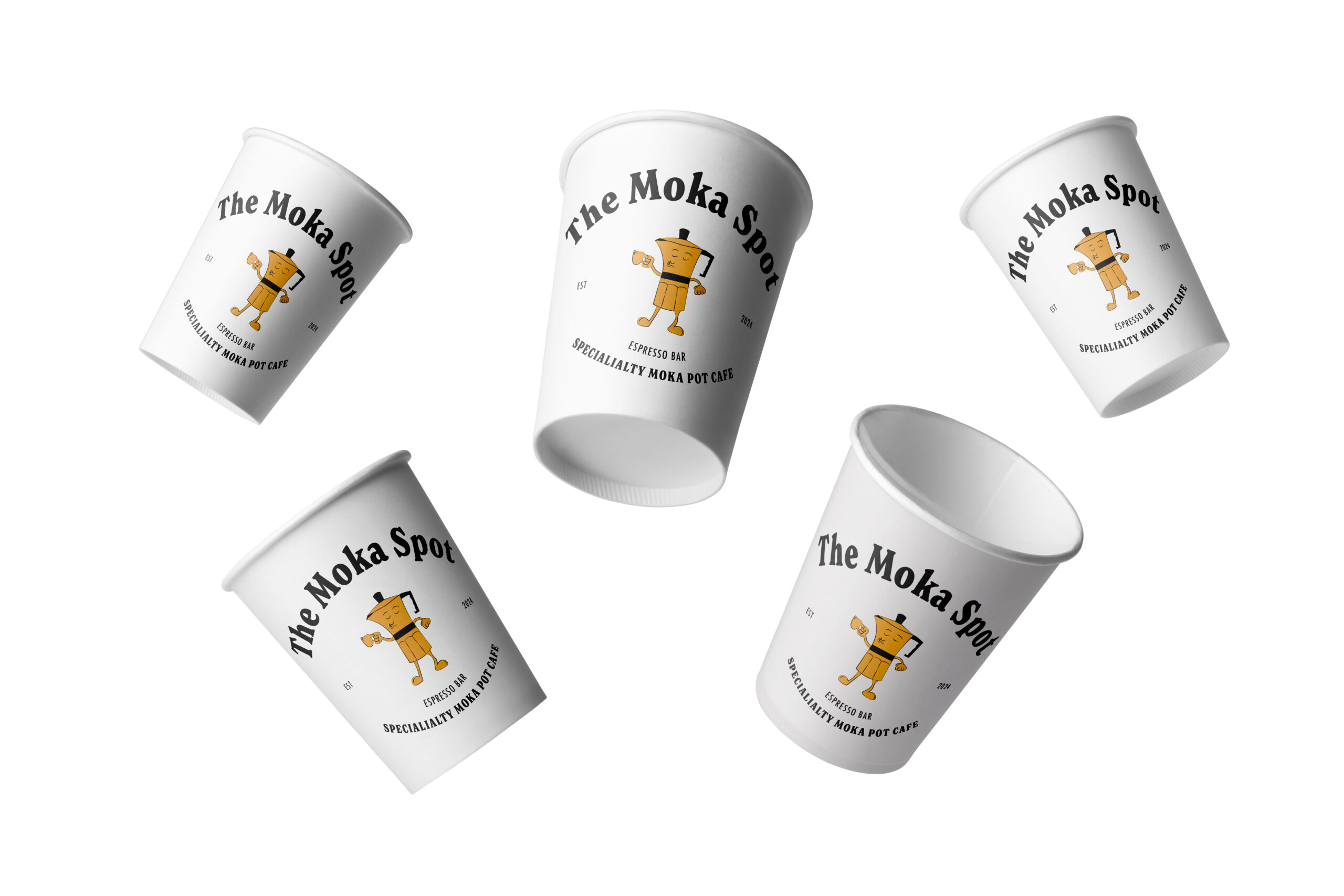
How It’s Used
Client / Context
The Moka Spot is a fictional specialty café concept centered around Moka pot–brewed coffee. This project explores how branding, illustration, and identity can celebrate a classic brewing method while giving it a fresh, contemporary visual voice.
Key Challenge
The challenge was balancing heritage and modernity, honoring the iconic 1933 Moka Pot invention while developing branding that feels current and inviting. I needed to create a system that worked across identity, signage, and promotional materials without feeling generic.
Solution
I crafted a logo and illustration suite that nods to the Moka Pot’s distinctive silhouette and integrated it with a bold visual language that pairs hand-drawn elements with clean, contemporary typography. The design includes a billboard series and a cohesive style guide that together evoke warmth, craftsmanship, and a modern café experience.


Result
The final concept presents a café identity that feels both nostalgic and forward-thinking. It communicates the unique focus on Moka brewing through sensory, expressive visuals while offering a flexible branding system that could extend across physical space, merchandise, and digital touchpoints.

Role: Brand Identity, Logo Design, • Tools: Illustrator, Photoshop
