
The Herbal Apothercary
Package Design / Photography / Illustration
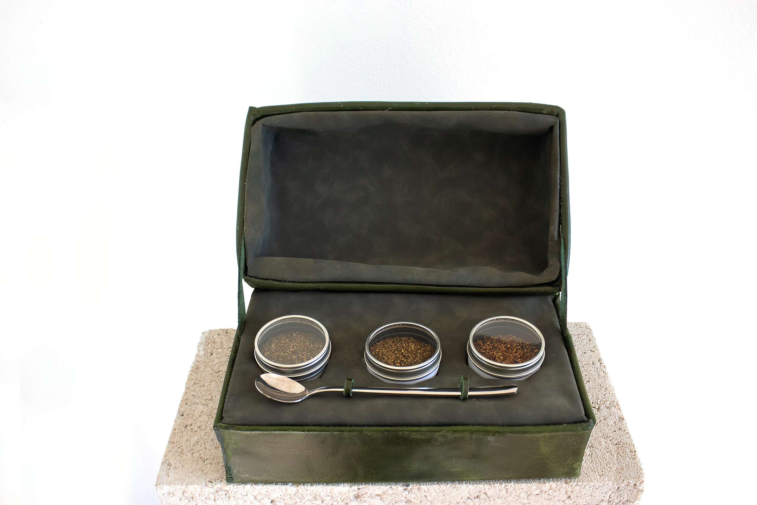
The Herbal Apothercary is a false company I created for this project. The task was to create a rigid box structure for luxorious herbs, which was a new and exciting challenge for me. I wanted to make these boxes not only visually appealing but also reusable for the user.
After much consideration, I decided to use real leather lined with real suede for the box. This decision was aimed at making the packaging stand out from my herbal competitors. In addition, inspired by the authenticity and craftsmanship of traditional apothecaries, our decision to use real leather for our packaging reflects our commitment to heritage and quality. Just as apothecaries wouldn’t compromise on the integrity of their medicines.
I then burned the leather with our logo, “The Herbal Apothecary,” in a subtle manner. The dark green color of the leather ensures that the logo is not overly obvious but noticeable enough for the user to remember to reorder when they run out of herbs.
The suede lining, in a green shade, was chosen to complement the leather and imitate the underneath of real leather, visible from the straps. The design also includes a removable box where the tea goes, adding to the reusability of the packaging.
In conclusion, I am extremely proud of this design. While it was challenging to work with leather, I am glad I chose the harder option to make the packaging stand out. This project has not only pushed my design skills but also made me feel like a better package designer.


